An organization's insignia—its logo—is the visual, outward manifestation of its very essence. It is the daily reminder to the people you serve, to those folks you most connect with, of just who you are and what you are all about. It nurtures an instant parade of expectations. No small effort goes into the creation of any logo. Our logo is a 130-year-old heritage heirloom that has evolved in much the same manner as our organization has evolved.
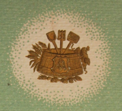
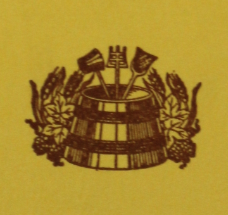
The elements central to our logo date back hundreds, if not thousands, of years. It proudly displays the primitive tools of an ancient brewing craft. Central to it is a wooden mash tub, tightly coopered with detailed wooden staves and metal hoops. Rising straight up from the mash tub's center is the timeless “brewer's paddle.” (The venerable volume, 100 Years Of Brewing, published in 1903 refers to it as a “mashing oar.”) The paddle is accompanied on either side by a thick mash ladle, and a hot wort dipper, all laced with turning and twisting wreath-like barley and hop images These basic, primitive brewing tools and utensils celebrate the excitement of the beginning a brew and initiating the mashing process. And in a more general sense, they serve to showcase our marvelous high-tech industry’s very humble beginnings!
 The Master Brewers logo shares its core look with numerous brewing logos around the world. For centuries, brewing guilds and organizations have used similar versions, most displaying brewing tools and barley/hop wreaths. That general look lent credibility to the quest of the brewing craft. To this very day, the Belgians still celebrate the “Knighthood of the Brewer's Paddle.” (Yep...KNIGHTHOOD! Move over Sir Lancelot! The Brewer's Paddle does NOT play second fiddle to Excalibur!)
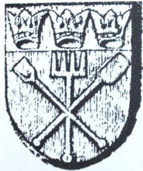
Consider the 13th century crest of The Brewer's Guild of Cologne, pictured right. I first saw this image in the book Prost! The Story Of German Beer by Horst Dornbusch. I was humbled by our common “logo heritage.”
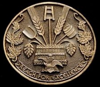 Back in the 1970s, Anheuser-Busch, my employer of 38 years, decided to inspire their brewers by initiating the “Reach For Excellence” program. They gifted us the belt buckle pictured left. Does anything look familiar?
The buckle was to inspire us to live up to the task of brewing our beers in the tradition of the centuries of brewing excellence before us. Each day as I slid into my Carharts and pulled on my brewing boots, that belt buckle beckoned me to pay attention to detail and to do all the right things. Even then, some 40 years ago, I was impressed that AB chose the images of primitive brewing tools over their many iconic symbols such as the Clydesdales, to inspire us. As you can see on the buckle itself, even the famous A & Eagle plays a small role in the intended message of excellence.
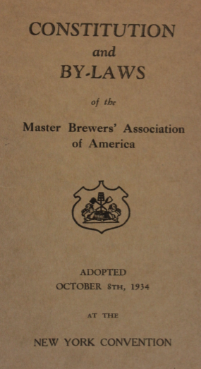
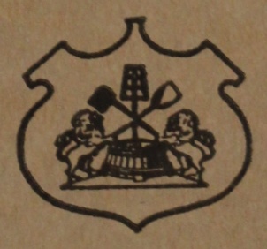
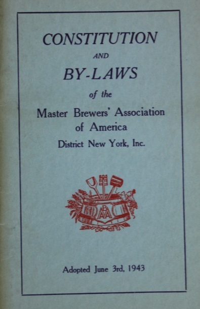
As I said, our Master Brewers logo has changed over time, but has always retained those ancient core elements. Below is an image of our Constitution & By-Laws printed from the New York Convention in 1934. Our logo, enlarged on the far right, displays the mash tub, paddles, and dippers all enclosed within a structured crest. Instead of a barley/hops wreath, it appears to display two “bock-style goats,” so characteristic of German bock beer labels.
Over time, the Master Brewers logo assumed several different renditions, but always maintained the core look that included the primitive brewing tools:
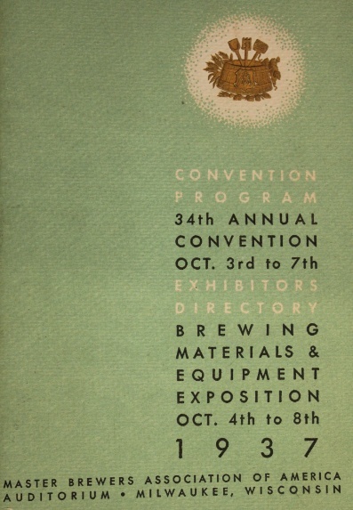
The printed program for the 1937 MBAA Convention put a bit of a different twist on our logo. The program featured a kind of “embossed” logo that included the trditional core elements. But to the front of the mash tub, a crest was added with an “MBAA” symbol, tightly and creatively arranged within it. This particular logo endured through the late 1930s ane 1940s, at least until 1955. Examples are illustrated as follows.
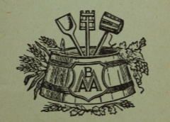
The printed Constitution and ByLaws from the 75th Anniversary Diamond Jubilee Convention in 1962 shows a logo without the “MBAA crest” on the mash tub:
The printed program of our 100th Anniversary gave us our most recognizable logo. In fine detail, it superbly illustrates the wood of the mash tub and brewing utensils. Even the malt shafts and hop leaves display crisp detals and a multitude of color. “MBAA” is “carved” onto the front of the mash tub. It became the "base logo" for associated events and designations such as our 125th anniversary and the the Beer Steward Program. These are pictured below.
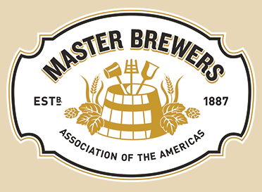 Enter 2016 and another major re-working. The colors are much more simple, in a three or four color format. The primitive utensils continue to prevail, although more subtle. A crest aspect has returned. The words "Master Brewers" are obviously the marquee message. But what strikes your Heritage Chair the most is that in our new logo that we have embraced our historical bragging rights. We are finally celebrating what sets us apart from many of the world's brewing organizations... the fact that our heritage goes back to 1887!
As we embrace the 2016 rendition of our logo, appreciate it as the heirloom that it is. Its core look has endured and has been shared around the world by numerous brewing organizations for centuries.
I will be taking a month off from our Communicator in October. A return trip to Deutschland, to include Munich for Oktoberfest will require all of my conscious thought!